Why Does One Painting Hold Our Attention?
Have you ever looked across a gallery, scrolled through a collection of paintings online, or walked into a room filled with artwork and found that one particular image stopped you?
You may not immediately know why.
Perhaps it is the colour. A flash of brilliant yellow against deep blue catches your eye. Perhaps a strong line seems to pull you into the picture. Perhaps one small shape holds everything around it together.
Sometimes the attraction is quieter. Nothing demands attention, yet the painting feels complete. You keep looking.
That reaction is rarely accidental.
It usually has something to do with composition — the way colour, shape, line, texture, space and tone are arranged and related to one another.
A painting does not have to be complicated to hold our attention. Nor does it need to contain an impressive subject.
What matters is what the parts of the painting are doing together.
Looking Is Not Quite the Same as Seeing
When we first look at a painting, we naturally recognise things.
A tree.
A hill.
A boat.
A flower.
A patch of water.
But there is another way of looking.
Instead of seeing only a tree, we can begin to notice a dark vertical shape.
Instead of seeing only a stretch of sky, we notice a large quiet area of pale colour.
A shoreline becomes a diagonal.
Flowers become repeated points of colour.
A reflection becomes a vertical pathway for the eye.
Once we begin looking in this way, a second structure appears beneath the subject.
This is one reason abstract art can be particularly useful when thinking about composition. When recognisable objects become less important, colour, line, shape, texture and space have to carry more of the visual responsibility.
We begin to notice not simply what something is, but what it is doing.
Where Did You Look First?
One of the simplest questions we can ask when looking at a painting is:
Where did my eye go first?
That first point of attention is often called the focal point or area of emphasis.
It may be created through strong colour.
A very light area surrounded by darkness.
An isolated shape.
A sharp edge.
Heavy texture.
Or simply something unexpected.
A focal point does not necessarily need to be large.
A tiny area of brilliant colour can command more attention than a much larger area of subdued colour.
This is because our eyes respond not only to size but to contrast and visual weight.
Introducing Held by Light
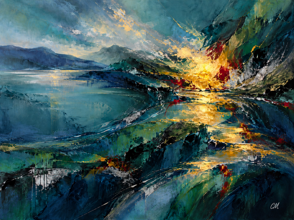
The painting created for this article, Held by Light, was designed around exactly this idea.
The first question behind it was simple:
Can a painting be constructed so that the viewer is drawn immediately towards one area, but then encouraged to keep looking?
The strongest area of the composition sits slightly to the right of centre.
There, intense gold and yellow emerge against surrounding teal, blue and deep green. Small crimson accents increase the contrast, while thicker texture makes the area feel even more active.
The intention is for the eye to arrive there quickly.
But that is only the beginning.
Why the Bright Area Feels So Strong
The golden area attracts attention partly because of its colour.
Warm yellows and golds appear particularly intense against cooler blues and blue-greens.
But colour alone is not responsible.
The contrast between light and dark increases its strength.
The surrounding forms are deeper and quieter. This allows the light area to appear even more luminous.
Texture adds another layer.
The surface around the focal point is more active and broken, while other parts of the painting are broader and calmer.
Several different forms of contrast are therefore working together:
- warm against cool
- light against dark
- rough against smooth
- intense against subdued
The focal point becomes strong because of the relationships around it.
That distinction matters.
Nothing in a painting works completely alone.
Visual Weight
We often talk about objects in a painting as though they have weight.
Of course, they do not literally weigh anything.
But some areas feel heavier than others.
A large dark shape can carry considerable visual weight.
So can an intensely coloured area.
Heavy texture can add weight.
A shape close to the edge can feel more significant than the same shape placed quietly near the centre.
This is one of the central ideas behind composition.
In Held by Light, the bright golden area is relatively small compared with the broad cooler regions on the left.
Yet it competes with them successfully.
That is because intensity can sometimes balance size.
A small, vivid area can counter a much larger quiet one.
This creates asymmetrical balance.
The two sides are not equal.
They do not mirror each other.
But they can still feel visually stable.
Where Does Your Eye Go Next?
A focal point gives the eye somewhere to begin.
But a painting should not necessarily end there.
Once the eye finds the first important area, it begins to move.
This visual journey is another important part of composition.
In Held by Light, diagonal and curved marks move towards the focal point from the quieter left side.
From there, smaller fragments of gold, green, crimson and silver continue through the lower part of the painting.
These repeated colours create connections.
The eye may move from one small accent to another without consciously realising why.
That is visual movement.
The painting itself is still.
The viewer is not.
Quiet Areas Matter Too
It is tempting to think that everything in a painting needs to be interesting.
Usually, that is not true.
If every area demands attention, the eye has nowhere to rest.
Quiet areas are important because they allow more active areas to feel stronger.
In Held by Light, the broader blue and teal region on the left provides that breathing space.
Compared with the energetic gold, crimson and broken texture on the right, it feels calmer.
That difference is intentional.
The quiet area supports the dramatic one.
This is one reason negative space and subdued passages are so valuable in painting.
What we leave quiet can be just as important as what we emphasise.
A Painting Is a Network of Relationships
One of the easiest mistakes when analysing a painting is to look at its parts separately.
Colour.
Line.
Texture.
Shape.
Space.
But composition becomes much more interesting when we look at the relationships between those things.
A bright yellow mark behaves differently beside pale cream than it does beside dark blue.
A rough surface feels rougher beside something smooth.
A small shape becomes more noticeable when isolated.
A diagonal feels more energetic when surrounded by horizontal forms.
Meaning emerges through comparison.
This is why changing one small part of a painting can sometimes affect the whole composition.
Move a shape.
Darken a colour.
Remove an accent.
Repeat a mark.
Suddenly the balance, emphasis or movement changes.
Try Looking Before Deciding
The next time you look at a painting, try resisting the urge to decide immediately whether you like it.
Instead, ask:
Where did I look first?
Then:
Where did my eye go next?
Then:
Which part feels visually strongest or heaviest?
These questions begin to reveal how the painting is working.
You may discover that you are being guided by colour.
Or by a diagonal.
Or by repeated marks.
Or by a single small area of contrast.
You do not need to know technical art vocabulary to notice these things.
You only need to slow down and look.
Try This With Your Own Painting
If you make art yourself, choose one finished painting and place it several steps away.
Do not think about how you made it.
Try to imagine that you are seeing it for the first time.
Ask yourself:
- What do I notice first?
- Is that where I intended the viewer to look?
- Where does my eye travel next?
- Which area carries the most visual weight?
- Is there somewhere for the eye to rest?
- Does one section compete too strongly with everything else?
Do not change anything immediately.
Just observe.
Often, seeing the problem clearly is more useful than rushing to fix it.
Why Does a Painting Hold Us?
There is no single answer.
One painting may hold our attention because of colour.
Another because of movement.
Another because of tension.
Another because its balance feels calm and inevitable.
Sometimes the attraction is immediate.
Sometimes it grows slowly.
Usually several things are working together.
That is the real fascination of composition.
A painting is not simply a collection of ingredients.
It is a network of visual relationships.
And the more carefully we look at those relationships, the more clearly we begin to understand why some paintings make us stop.
And keep looking.
About the Painting
Held by Light was created specifically for this article as an exploration of emphasis, visual weight and movement.
The composition uses cooler blue, teal and green areas against a concentrated passage of gold, yellow and crimson. The brighter, more heavily textured focal area is balanced by quieter, broader forms elsewhere in the painting.
The intention is simple:
to catch the eye — and then give it somewhere to go.
This article is inspired by ideas explored more fully in Why a Painting Works, a book about composition, visual relationships and learning to see art more carefully.