Three Abstract Paintings, Three Different Ways to Transform a Room
Abstract art has an unusual ability to change the atmosphere of a room. It does not need to depict a recognisable landscape, figure or object to create an emotional response. Instead, colour, texture, movement and composition do the work. A strong abstract painting can become a focal point, introduce energy into a quiet interior or bring together colours already present within a room.
These three paintings explore very different approaches to abstraction. Although each uses bold colour and visible texture, their personalities are quite distinct: one is energetic and spontaneous, another structured and geometric, while the third is more atmospheric and expressive.

Primary Colour Abstract — Energy and Movement
The first painting immediately makes an impact through its powerful combination of blue, red and yellow. Deep cobalt and ultramarine blues dominate the composition, providing a rich background against which brilliant red and flashes of intense yellow emerge.
The style is expressive and spontaneous. Thick, visible brushwork gives the surface an almost sculptural quality, while scattered areas of colour create movement rather than forming obvious shapes. Red sweeps across sections of the painting in energetic bursts, while yellow appears in smaller concentrated areas, almost like sudden shafts of light.
Its composition feels deliberately unpredictable. The eye moves around the painting rather than settling on one central subject. Darker blue areas provide depth, while lighter blues, touches of white and occasional near-black passages prevent the primary colours from becoming too uniform.
This is a painting that would work particularly well in a modern living room, contemporary hallway, home office or creative workspace. Against white, pale grey or neutral walls, the colours would appear especially vivid. It could also provide a dramatic contrast in an industrial-style interior containing dark furniture, steel or exposed brick.
It is an artwork for a room that benefits from energy.
Circles of Harmony — Geometric Order
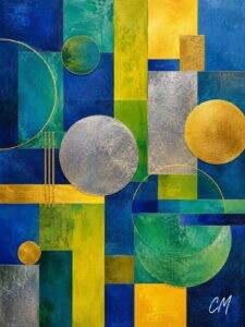
Circles of Harmony takes an almost opposite approach. Here, abstraction is controlled through geometry.
Rectangles, vertical panels, circles and sweeping curved lines overlap to create a carefully balanced composition. Deep blues provide much of the visual foundation, joined by turquoise, teal, green and vibrant yellow. Metallic-looking gold and silver elements introduce a luxurious additional layer.
The circles are particularly important. Some are solid and substantial, including the large textured silver and gold discs, while others are simply defined by fine outlines. These rounded forms soften the strong vertical and horizontal divisions created by the rectangular sections.
There is also an appealing tension between precision and texture. From a distance the painting appears ordered and architectural. Closer examination reveals textured surfaces and subtle variations within the colour fields.
Because of its structured character, Circles of Harmony would be particularly effective in a contemporary dining room, stylish hallway, modern apartment or office reception area. The blues and greens could complement natural wood furniture, while the gold and silver details would work beautifully alongside metallic lighting, glass, brass or chrome accessories.
It could also suit a room decorated in navy, teal or mustard, helping connect those colours without making the interior feel overly coordinated.
Gilded Resonance — Drama and Elegance
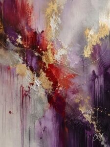
The third painting, Gilded Resonance, has a more atmospheric quality.
Its palette brings together maroon, crimson red, purple, lavender, silver, white and gold. Rather than filling the entire canvas with equally intense colour, the composition contains areas of quiet space alongside concentrated passages of texture.
A dramatic vertical arrangement of burgundy, purple and red runs through the painting, interrupted by heavily textured gold and silver areas. Paint appears to drip downward in places, creating a sense of gravity and movement.
Perhaps the most distinctive compositional feature is the series of fine sweeping curved lines crossing the centre. They introduce elegance and rhythm, almost suggesting sound waves, flowing fabric or musical movement without representing any of them literally.
The pale lavender and silver-grey background gives the stronger colours room to breathe. Gold catches the eye in smaller areas, adding warmth and a sense of richness without overwhelming the composition.
Gilded Resonance would look particularly striking in a bedroom, elegant living room, dining area or sophisticated hallway. It would suit interiors containing soft greys, cream, plum, wine red or muted purple, while the gold details could echo lamps, mirrors or decorative accessories.
Unlike the energetic primary-colour painting, this work creates a more contemplative mood.
Choosing Abstract Art for Your Home
These three paintings demonstrate just how varied abstract art can be.
The first uses colour and expressive brushwork to create energy. Circles of Harmony uses geometry and metallic accents to create balance and structure. Gilded Resonance combines flowing movement, texture and a sophisticated palette to create atmosphere and elegance.
Choosing between them therefore becomes less about finding an image that “matches the sofa” and more about asking a different question:
How do you want the room to feel?
That is one of the great pleasures of abstract art. A painting does not simply occupy a wall. It can alter the character of the space around it.