Balance in Art: Why Unequal Things Can Still Feel Balanced
Balance is one of those things we often feel in a painting before we consciously recognise it.
A composition may feel calm.
Settled.
Energetic.
Tense but controlled.
Or it may feel as though one side is pulling too strongly against the other.
That sensation comes from visual weight.
And understanding visual weight helps explain something that can seem puzzling at first:
two sides of a painting can be completely different and still feel perfectly balanced.
Balance does not mean equality.
It does not mean placing one tree on the left and another tree on the right.
It does not mean dividing the canvas into two matching halves.
Balance is about creating relationships between the different visual forces in a composition.
What Is Visual Weight?
Nothing inside a painting actually weighs anything.
Yet some things appear heavier than others.
A large dark shape can dominate a canvas.
A much smaller area of brilliant yellow may pull just as strongly in the opposite direction.
A heavily textured area may attract more attention than a larger smooth one.
A bright red mark may compete with a broad area of muted grey.
Even placement matters.
A shape close to the edge of a painting can feel more significant than the same shape nearer the centre.
Visual weight can therefore come from:
- size
- colour
- darkness or lightness
- saturation
- texture
- detail
- position
The important point is that these qualities interact.
A large pale object may actually feel lighter than a much smaller dark one.
A tiny metallic highlight can attract more attention than a broad neutral area.
A vivid warm colour can carry surprising visual force.
This is why balance cannot be measured with a ruler.
The eye decides.
The manuscript identifies size, colour and value, texture and placement as major sources of visual weight.
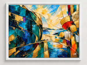 https://www.clementsmcculloch.com/product/counterbalance-an-abstract-art-painting/
Physical Balance and Visual Balance Are Different
Imagine an old-fashioned pair of scales.
Place an object of equal weight on either side and the scales remain level.
That is physical balance.
Painting does not work quite like that.
Imagine two identical circles.
One is pale grey.
The other is deep crimson.
They are the same size.
But will they feel equally important?
Probably not.
The crimson circle may attract far more attention.
Now imagine one large pale-blue rectangle and three much smaller golden shapes.
The rectangle occupies more space.
Yet the gold shapes may still provide enough visual strength to balance it.
The surface area is unequal.
The attention is not.
That is visual balance.
Symmetrical Balance
The easiest kind of balance to recognise is symmetry.
If the painting were divided down the centre, the two sides would appear similar.
Symmetry can feel:
- calm
- formal
- stable
- dignified
- predictable
Architecture often uses it.
So does nature.
Butterfly wings.
Flowers.
Faces.
Leaves.
Shells.
Symmetry gives the viewer an immediate sense of order.
But perfect symmetry can also become static.
If everything on one side is repeated exactly on the other, there may be very little reason for the eye to continue exploring.
That is why artists often introduce small variations within a basically symmetrical structure.
The balance remains.
The painting stays alive.
Asymmetrical Balance
This is where things become more interesting.
In asymmetrical balance, the two sides are different.
One side might contain:
a large dark form.
The other might contain:
three smaller bright shapes.
One side may be heavily textured.
The other may contain an area of intense colour.
One side may be crowded.
The other may be quieter but strongly placed.
Nothing matches.
Yet the painting can still feel completely stable.
This type of balance appears constantly in landscape.
A large dark hill on one side might be balanced by open water and bright sky on the other.
A tree may dominate one side while sunlight on the opposite side provides the visual response.
A cluster of wildflowers may carry weight in one corner while a golden reflection balances it elsewhere.
The forms are different.
The forces feel equal enough.
That is asymmetrical balance.
The book describes this kind of balance as particularly lively and dynamic because it achieves stability without mirroring.
Size Is Only Part of the Story
Large shapes usually attract more attention than small ones.
But not always.
Suppose the left side of an abstract painting contains one broad blue shape.
On the right are three small gold and silver forms.
Individually, none of the smaller shapes competes with the blue.
Together, however, they may.
This is particularly useful in abstract painting because several small forms can create enough visual activity to counter one larger mass.
You do not need another large object.
Sometimes adding one would actually make the composition too heavy.
Dark Often Feels Heavier Than Light
Dark values tend to carry more visual weight.
A deep navy shape can feel substantial.
A pale cream area often feels lighter and more open.
This means a relatively small dark form can balance a much larger pale region.
Think of a landscape containing a huge expanse of pale sky.
At the bottom sits a small group of nearly black trees.
The trees may occupy only a tiny percentage of the picture.
Yet visually they can anchor the entire composition.
Darkness gives them authority.
Bright Colour Can Punch Above Its Weight
Colour intensity can completely change balance.
Imagine a large area of soft green.
Now place one small vivid red mark on the opposite side.
Suddenly the red becomes difficult to ignore.
It may be tiny.
But visually it carries considerable weight.
This is one of the most useful compositional tools available to an artist.
If one side of a painting feels too heavy, the answer is not always:
add another large object.
Sometimes the solution is simply:
add one small colour accent.
The manuscript makes exactly this point: a small vibrant area can counterbalance something much larger and more subdued.
Texture Has Weight Too
A smooth surface tends to feel quieter.
Heavy impasto, scratches, metallic effects and detailed brushwork attract attention.
That means texture can act almost like colour.
A small heavily worked area may balance a much larger simple area.
Metallic gold and silver can be particularly strong.
They do not merely have colour.
They change as light catches the surface.
A small metallic passage can therefore become unexpectedly dominant.
This makes texture an important part of balance, especially in abstract work.
Placement Changes Everything
A shape does not have the same visual weight everywhere on a canvas.
A central shape often feels secure.
Move it towards an edge and tension increases.
Move it close to a corner and it may suddenly feel much stronger.
Why?
Because the viewer senses the boundary.
A form near the edge can feel as though it might leave the composition.
That makes us more aware of it.
This is why relatively small elements near edges can sometimes balance much larger central shapes.
And it is also why a strong colour placed carelessly near the edge can accidentally pull the viewer out of the painting.
Busy and Quiet Can Balance Each Other
Another common misunderstanding is that both sides of a painting need the same amount of detail.
They do not.
Imagine one side filled with flowers, grasses, texture and small marks.
The other side is a broad quiet field.
The detailed side will probably feel heavier.
But the solution is not necessarily to make the quiet side equally busy.
That would remove the contrast.
A strong shape.
A darker value.
Or a small vivid colour might be enough.
Good balance often includes a relationship between busy and quiet.
The contrast makes both more effective.
Balance Through Repetition
Repeated elements can also distribute weight.
Several small yellow marks placed around a composition can spread attention.
A recurring leaf shape can carry the eye across the canvas.
Small metallic accents appearing in several places can prevent one area from becoming isolated.
This shows how the principles of art overlap.
Balance can interact with:
pattern,
rhythm,
movement,
and unity.
A painting does not solve each principle separately.
Several relationships usually work together.
Balance Does Not Mean Stillness
A balanced painting does not have to feel calm.
This is worth emphasising.
A composition can contain:
strong diagonals,
fractured shapes,
vivid colour,
energetic brushwork,
and dramatic contrast,
yet still feel balanced.
Balance simply prevents all that energy from becoming visually uncontrolled.
The painting can seem to move without feeling as though it is going to fall apart.
That is often what makes asymmetrical balance so exciting.
What About Deliberate Imbalance?
Artists do not always want comfortable balance.
A painting may deliberately place most of its weight on one side.
An object might sit uncomfortably close to an edge.
One corner may carry almost all the activity.
Why would an artist do that?
To create:
- tension
- unease
- anticipation
- drama
- movement
The difference lies in intention.
Accidental imbalance can make a painting feel unresolved.
Deliberate imbalance can become part of its emotional character.
Understanding balance therefore does not mean always correcting instability.
It gives the artist the choice to use instability deliberately.
A Simple Way to Check Balance
If a painting feels wrong but you cannot identify the problem, ignore the details.
Look only at the largest visual masses.
Ask:
Where are the darkest areas?
Where are the brightest colours?
Where is the strongest texture?
Which side attracts my eye more?
Then ask:
Why?
You may discover that one shape is too dark.
Or one colour too saturated.
Or a corner too busy.
The solution may be surprisingly small.
Move something.
Reduce the saturation.
Remove detail.
Lighten a value.
Add one small colour accent elsewhere.
Balance is often improved through adjustment rather than reconstruction.
Make the Painting Tiny
A thumbnail is an excellent balance test.
Reduce the image until most detail disappears.
Only the large relationships remain.
If one side suddenly looks extremely heavy, you will notice immediately.
This technique is also useful before a painting begins.
Several small thumbnail studies can test different arrangements without becoming distracted by detail.
Remove the Colour
Convert a photograph of the painting to black and white.
Now look again.
Perhaps a composition that seemed balanced in colour suddenly reveals a large dark mass on one side.
Or two colours that appeared very different now merge because their values are almost identical.
Colour balance and value balance are related, but they are not always the same.
Flip the Painting
Artists become extremely familiar with their own work.
After looking at an image for hours, awkward relationships can become almost invisible.
Flip the painting horizontally.
Or look at it in a mirror.
Suddenly it becomes unfamiliar.
A heavy corner may jump out.
A gap may feel awkward.
A shape may appear too close to an edge.
Nothing has actually changed.
Your familiarity has.
Try This With Your Own Painting
Choose a finished artwork.
Stand several steps away.
Ask:
Which part feels heaviest?
Then identify why.
Is it:
- larger?
- darker?
- brighter?
- warmer?
- more textured?
- more detailed?
- closer to an edge?
Now locate the area that balances it.
Do not assume the counterweight will look similar.
It might be completely different.
That is the point.
If you can identify how those unequal areas hold each other in relationship, you are beginning to understand the balance of the painting.
Try It Yourself — Four Ways to Balance the Same Ingredients
Create four small compositions using only:
- one large dark shape
- three small bright shapes
- one textured area
- a pale background
Composition One — Symmetrical
Arrange the elements so both sides are similar.
Notice the stability.
Composition Two — Asymmetrical
Move the large shape towards one side.
Use the smaller bright elements as a counterweight.
Notice how the composition becomes more dynamic.
Composition Three — Radial
Arrange the elements around a central point.
Notice how attention keeps returning towards the centre.
Composition Four — Deliberately Unbalanced
Push most of the visual weight towards one edge.
Do not correct it.
Notice the tension.
The ingredients barely change.
The emotional experience does.
This is one of the most useful lessons in composition.
Balance Is Relationship, Not Equality
This may be the simplest way to remember the whole idea:
Balance does not require equality. It requires relationship.
Large can balance small.
Dark can balance bright.
Smooth can balance textured.
Quiet can balance busy.
Cool can balance warm.
A single vivid shape can counter a broad muted area.
Several small marks can respond to one dominant mass.
Once you begin seeing balance this way, paintings become much more interesting.
You stop looking for matching objects.
You start recognising forces.
And that is where balance becomes a creative tool rather than a rule.
This article develops ideas from Why a Painting Works, where balance is explored through visual weight, asymmetry, colour, value, texture, placement and deliberate instability.