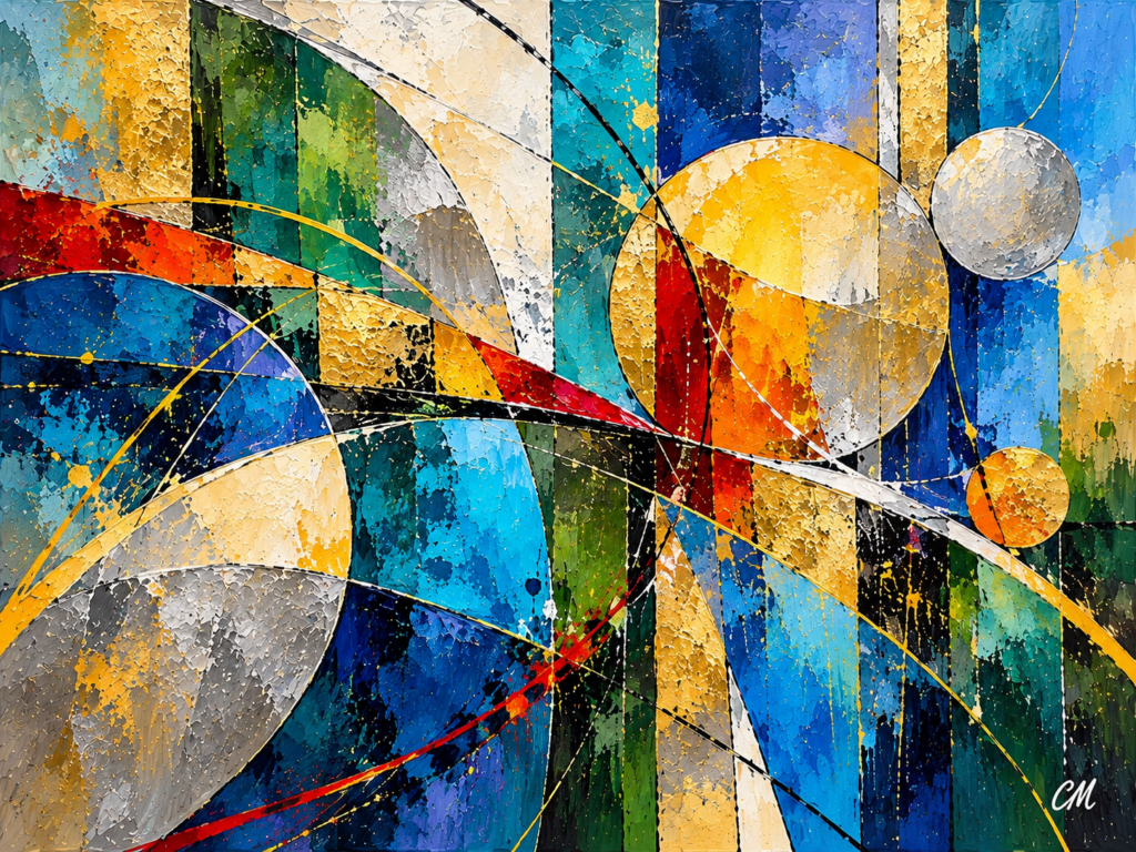
The Elements of Art: What Every Composition Is Made From
Every painting begins with ingredients.
Before there is balance, movement, rhythm or unity, there must be something to organise.
A line.
A shape.
A colour.
A patch of darkness.
A rough surface.
An open space.
These are the elements of art — the basic visual materials from which compositions are made.
It can be useful to think of them rather like ingredients in cooking.
Having flour, vegetables, spices and butter does not automatically produce a successful meal. The ingredients still have to be combined in the right relationships.
Painting works in much the same way.
The elements give us the material.
Composition gives that material structure.
And the fascinating part is that the same handful of elements can be arranged in almost limitless ways.
Elements and Principles Are Not the Same Thing
The terms are sometimes confused.
The elements of art are the things an artist works with.
They include:
- line
- shape
- form
- colour
- value
- texture
- space
The principles of art describe what happens when those elements are organised.
Balance.
Contrast.
Emphasis.
Movement.
Pattern.
Rhythm.
Unity.
So a line is an element.
But a group of lines arranged diagonally might create movement.
Colour is an element.
But one brilliant yellow shape surrounded by muted blue might create contrast and emphasis.
Shapes are elements.
Repeat them and we begin to see pattern.
Change their size and spacing and rhythm can appear.
The ingredients remain the same.
Their relationships change everything.
1. Line — More Than a Mark
A line seems simple.
A pencil moves across paper.
A brush crosses a canvas.
A digital stylus leaves a mark.
Yet line is one of the most powerful tools an artist has.
Lines can:
- divide
- connect
- point
- enclose
- interrupt
- guide
Different directions create different sensations.
A horizontal line often feels restful.
Think of a calm horizon stretching across still water.
A vertical line can feel stronger and more stable.
A tree trunk, standing figure or column naturally produces that effect.
A diagonal line immediately adds more energy.
It seems less settled.
More active.
More likely to move.
Curved lines behave differently again. They may glide gently through a landscape or spiral through an abstract painting.
But perhaps the most interesting lines are those that are not actually drawn.
The Invisible Line
Imagine five trees becoming progressively smaller as they approach the horizon.
Your eye joins them together.
Or several shapes running diagonally across an abstract painting.
Again, the eye connects them.
A line has appeared in your perception even though the artist never painted one continuous stroke.
These implied lines are one of the quietest ways an artist can control movement.
2. Shape — The Structure Beneath the Subject
A shape is an enclosed area.
Some shapes are geometric:
- squares
- rectangles
- triangles
- circles
Others are organic:
- leaves
- clouds
- rocks
- pools of water
- irregular masses of paint
One of the most useful skills an artist can develop is learning to see complicated subjects as simple shapes.
A hill can become a broad triangle.
A tree canopy becomes an irregular mass.
A building becomes a collection of rectangles.
A flower may become a circle surrounded by radiating forms.
This prevents us from becoming trapped in detail too soon.
Instead of asking:
Does this look enough like a tree?
we can first ask:
Does this shape work here?
That is a very different question.
Shapes Have Character
Different shapes also carry different visual personalities.
Rectangles can feel controlled or architectural.
Triangles often feel directional.
Circles may appear softer or more complete.
Organic shapes introduce irregularity and natural movement.
Put a single circle among a group of rectangles and something interesting happens.
The circle immediately becomes more noticeable.
Nothing has changed about the circle itself.
Its surroundings have given it importance.
That is composition beginning to emerge.
3. Form — Creating the Illusion of Depth
Shape is generally two-dimensional.
Form suggests three dimensions.
A circle can become a sphere.
A square can become a cube.
A triangle may suggest a cone or pyramid.
In painting, form is usually an illusion.
We create it through:
- light
- shadow
- value
- colour
- perspective
- edges
A flat circle may suddenly appear rounded when one side is light and the other dark.
A rectangle begins to feel architectural when perspective gives it depth.
But form does not have to represent a recognisable object.
In abstract painting, overlapping colour planes can appear to sit in front of one another.
Thick textures can feel raised.
Metallic areas can appear to catch light differently from matt surfaces.
Depth can exist without conventional subject matter.
4. Colour — Emotion and Structure
Colour is often the first thing we notice in a painting.
Before we examine the drawing or understand the subject, colour has already begun affecting us.
Blue may feel spacious.
Deep red can feel warm or dramatic.
Yellow can produce energy.
Muted earth tones may create restraint.
But colour is much more than mood.
It is also structural.
A colour changes depending on what surrounds it.
Blue beside another blue may feel quiet.
Place that same blue beside orange and its character changes.
A red mark surrounded by other vivid colours may blend into the overall energy.
Put the same red into a field of soft grey and it may become impossible to ignore.
Colour Can Carry Weight
This is particularly important.
A small intense colour can visually balance a much larger muted area.
So colour can help determine:
- where we look first
- how a painting balances
- which areas advance
- which areas recede
- how different parts connect
It is not merely decoration.
Colour helps build the composition.
5. Value — Light and Dark
Value means how light or dark something appears.
If you convert a colourful painting into black and white, the hue disappears.
But the value structure remains.
That can reveal a surprising amount.
Two colours may look completely different in colour but become almost identical in greyscale.
Alternatively, a pale yellow beside a deep violet might produce enormous separation.
Value helps create:
- depth
- highlights
- shadows
- form
- emphasis
One brilliant light area inside a dark painting can become an extremely powerful focal point.
A painting made from closely related values may feel softer and more atmospheric.
Neither is automatically better.
They simply create different experiences.
Try Squinting
One of the easiest ways to see value is to squint at a painting.
Detail disappears.
Small shapes merge.
What remains is the broad structure of light and dark.
It is a remarkably simple way of seeing whether the large composition is holding together.
6. Texture — Giving the Surface a Voice
Texture is the character of a surface.
Sometimes it is physical.
Thick paint.
Scraped paint.
Canvas weave.
Collage.
Metallic leaf.
Sand or other material mixed into paint.
At other times texture is only suggested.
A digitally created image can look as though it contains thick impasto even though the printed surface is completely smooth.
A painted rock can appear rough.
Water can appear glassy.
Clouds can seem soft.
Texture creates another kind of contrast.
Rough beside smooth.
Busy beside quiet.
Matt beside reflective.
A small area containing heavy texture can attract more attention than a much larger smooth section.
That gives texture visual weight.
In abstract art especially, texture can become one of the major events in the painting.
7. Space — The Element We Often Forget
Space exists between, around and within things.
Artists naturally pay attention to objects.
We paint the tree.
The flower.
The hill.
The shape.
But the spaces around those objects matter just as much.
A large area of sky can give a painting room to breathe.
A gap between two shapes can create tension.
A small isolated form surrounded by open space may suddenly feel very important.
This is why empty space is never really empty.
It participates in the composition.
Negative Space
The spaces around objects are often called negative space.
It can:
- create rest
- isolate a focal point
- simplify a composition
- produce tension
- give movement somewhere to occur
Sometimes the most useful thing an artist can add to a painting is nothing at all.
The Elements Never Work Alone
This may be the most important point.
We can discuss line, shape, colour, texture and space separately.
But inside an actual painting, they constantly affect one another.
A colour changes because of the colour beside it.
A shape appears larger because of what surrounds it.
A rough area seems rougher beside something smooth.
A dark shape feels heavier when surrounded by pale space.
A diagonal becomes more energetic when set against horizontal forms.
The artist is always working with relationships.
Your manuscript makes exactly this point: changing one apparently small element can alter balance, emphasis, contrast, rhythm and unity elsewhere in the painting.
That is why painting can be so unpredictable.
Change one thing and several other things change with it.
Imagine Five Simple Ingredients
Suppose we begin with:
a dark rectangle,
three yellow circles,
one sweeping curved line,
a rough silver area,
and a large field of blue.
At this point, we simply have elements.
Now organise them.
Put the dark rectangle on one side and use the yellow circles to counter its visual weight.
We have begun creating balance.
Make the yellow stand strongly against blue.
Now there is contrast.
Make one circle larger.
It creates emphasis.
Let the curved line lead between the circles.
Now we have movement.
Repeat the circles evenly.
That creates pattern.
Change their size and spacing.
Now we begin to see rhythm.
Use related colours and shapes throughout so everything belongs together.
The composition begins to gain unity.
The elements have not changed.
Their relationships have.
This is why composition is creative rather than mechanical.
Everything Should Not Be Equally Important
Another important lesson follows from this.
Not every element needs to shout.
If everything demands attention, nothing feels particularly important.
A successful composition usually contains some degree of hierarchy.
One colour may dominate.
One shape may become the focal point.
One area may contain strong texture.
Another may remain deliberately quiet.
This relationship between dominant and supporting areas helps the viewer know where to look.
It also gives the painting somewhere to breathe.
Variety Needs Restraint
Artists face two tempting extremes.
The first is:
keep adding.
Another colour.
Another texture.
Another shape.
Another mark.
Another highlight.
Eventually the painting contains plenty of variety, but nothing has authority.
The opposite problem is:
repeat everything that works.
Every colour harmonises.
Every shape matches.
Everything is consistent.
Nothing surprises us.
Now the work may become predictable.
Good composition often exists somewhere between those two extremes.
Enough unity to make the painting belong together.
Enough variety to keep it alive.
Try This With One of Your Own Paintings
Choose a finished painting.
For the moment, do not decide whether it is good or bad.
Instead, identify the elements.
Ask:
Line:
Where are the strongest lines?
Shape:
Which shapes dominate?
Colour:
Which colour occupies the most space?
Value:
Where are the lightest and darkest areas?
Texture:
Where is the surface most active?
Space:
Where are the quiet or open areas?
Now look again.
Which of those elements attracts your attention first?
Why?
Perhaps the largest shape is not actually the strongest one.
Perhaps a tiny bright colour carries more visual weight.
Perhaps texture rather than colour creates the focal point.
You have already begun analysing composition.
The manuscript uses essentially this exercise as a way of moving from identifying the ingredients to understanding what they are doing.
Try It Yourself — Four Shapes and Three Colours
Here is a simple exercise.
Create a composition using only:
- one large rectangle
- three circles
- one diagonal line
- three colours
Do not try to represent anything.
Arrange them until the composition feels convincing.
Then change just one thing.
Move one circle.
Look again.
Change its colour.
Look again.
Increase its size.
Look again.
You may be surprised by how much changes.
A single alteration can change visual weight, movement, emphasis and balance.
That awareness is at the heart of composition.
The Building Blocks Are Simple — The Possibilities Are Not
Line.
Shape.
Form.
Colour.
Value.
Texture.
Space.
None of these elements is particularly complicated on its own.
Yet combinations of them have produced every painting we have ever seen.
That is what makes the subject so interesting.
An artist does not need hundreds of ingredients.
The possibilities come from relationships.
Where something sits.
How large it is.
What surrounds it.
What colour it becomes.
Whether it repeats.
Whether it stands alone.
How much space is left around it.
The elements give us the materials.
What we do with them gives the painting its character.
And once we learn to recognise those ingredients, paintings begin to reveal their structure in an entirely different way.