Sometimes when I am exhibiting my paintings I am asked, how do you decide what to paint? Usually, my answer is I have a feeling that day based on something I have noticed and liked. It could come from anywhere, looking around outside, noticed it on tv, or online. Quite often that feeling is based on a combination of colours that I like. They go together well and that brings us to the Colour Wheel.
As an artist you need to be very aware of the colour wheel and its layout. It is fascinating how the various colours can be combined to produce a piece of art that is considered by most people to be very good and pleasing to view. Over the centuries experts have honed down what colours go well together to make a good piece of art.
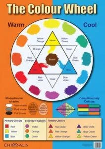
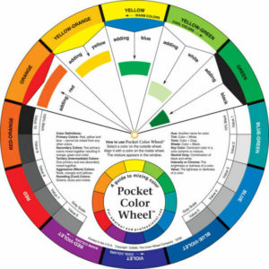
If we use this colour wheel poster shown above as an example, it shows us quite a lot of information that we can use to make our choice of which paint colours to use together. The poster shows warm and cool colours. So we can decide to make our painting to feel warm by our choice of colours or cool. We could choose two from the warm side and one cool colour. We might have the two warm colours dominate the painting and the cool one be an accent or focal point.
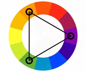
This type of method is called Triadic.
I am sure most professional artist regularly study the colour wheel, whether physically have one in front of them or know it so well that they refer to it in their mind, when painting. Obviously, some artists consider the colours they want to use for quite a while before starting a painting. They may consider the composition of the painting and the colours they see in each particular place on the canvas. They plan. Other artists don’t do any of that. They work on instinct or inspiration and make it up as they proceed through the painting. Afterall, if it doesn’t look good, they can easily redo it by either removing the paint or painting over it later.
Both methods work. Neither is wrong. It all depends on what type of artist you are or become in the long run. If you like to plan, do it. If you are the type that draws on inspiration and in the moment, then that is ok as well. You decide. As for me, I like to do a bit of planning first. I do wake up and have inspiration from something I have seen, then try to imagine how I can use that vision to capture it on canvas.
My thoughts and feelings are based on the environment around me, here in Scotland. The land and sea within view. The colours I witness each season have an effect on the choice of paint colour I use to construct a piece of art. But there is more. As an artist you also have inner feelings about how you want to see mankind, society and the world. Somehow, when I paint I want to capture those feelings in the artwork. Feelings of peace, harmony, understanding and acceptance that not everyone is the same as me. I want to paint artwork that conveys those feelings in a positive way.
I chose colours that are associated with positivity, peacefulness, calmness etc. I do not want to paint angry images. So I concentrate on those colours that convey the feelings I want to project. I then think about composition in the painting.
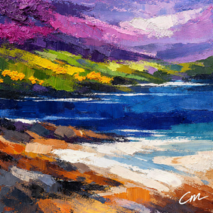
Now, because I paint abstract art as well as abstract realism art, the composition is different. In abstract realism art, I choose the colours and which one is dominant. For example, blue, green and yellow. Two cool colours and one warm, with the blue being 70% of the image, green 25% and yellow only 5% – the accent colour. Blue may be the sea and the green the fields; leaving the yellow to be possibly the sun and its rays.
In abstract art, the colour choice may be similar but the composition completely different. The blue again might be 70% dominant and the green evident throughout the image but the yellow could be the colour of lines running across the entire painting.
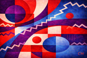
In the painting above, I used several colours – blue, purple and red. Two cool colours and one warm, with white used for squiggly thick lines across the painting.
Shapes are the next consideration to implement in your art piece. Most professionals reckon on 7 shapes of various sizes in a painting are enough to provide a pleasant scene that most people will agree is good. The larger shapes tend to have the dominant colour, such as blue for the sea. Smaller shapes have a variety of tones of the secondary colour green, such as trees, bushes and grass. Finally, the accent colour of 5%, which may be yellow for the sun or orange for a part of the sky.
In abstract art it will be similar regarding shapes with probably at least 7 shapes on offer. More recently I have been painting geometric shapes – circles, squares and rectangles. All layered or overlapping with each other. Varying the sizes to see want is interesting to view and fits into the composition. Colour is chosen to convey messages of peace, calmness and harmony. So no scary shapes!
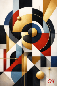
In the above Locomotion painting, I have used a variety of geometric shapes of different sizes. A message within the shapes gives one of motion and progression. Triangles convey action, whereas the squares and rectangles are used to give a sense of order and stability. The different sizes of circles throughout the painting are there to suggest unity and wholeness within your life. The colours were used to convey a message of happiness, energy and joy.
Having discussed colour and shapes, that leaves composition as the third main consideration when deciding what to paint. Composition is about the layout of the shapes, basically. The position of the various shapes is important because you want the viewer to move their eyes over the scene you have painted and focus eventually on your focal point.
This movement of eyes over your painting can be planned or it might be a happy accident! For all the times Bob Ross, an American oil painter of fame in the 1990s, mentioned Happy Accidents, his paintings were definitely composed! The position of trees and buildings etc were always designed to move the viewers eye in the direction he wanted them. Old masters were the same. In fact, terms like – the rule of thirds and the Golden Circle, were used widely. Even today many artist will stick to these rules. I used the rule of thirds this month, when I completed the painting below.
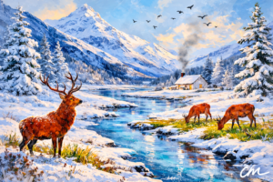
Winter Grazing, which I completed in February this year was planned out using the rule of thirds in my composition. The red deer’s head in the foreground, is exactly a third the way from the lefthandside as well as third the way from the bottom of the canvas. The other deer are similarly placed on the righthandside. Also, the cottage is two thirds from the bottom of the canvas and a third the way from the righthandside. So all the main view points are in versions of a third. It makes the scene more interesting because the colour palette is limited due to the amount of snow!
In summary, these are some of the things I consider when deciding on what to paint. Colours I see around me each day and shapes that may prove interesting in an overall scene. With a message of peace, harmony and calmness conveyed in my choice of composition. Whether abstract or abstract realism art I always want to try to achieve a good piece of artwork for a viewer to consider good enough to buy and display in their home or office.