Understanding Visual Equilibrium
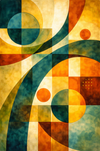
Abstract art often appears free, expressive, and spontaneous, yet beneath the surface of strong abstract work lies a careful sense of balance. In this context, balance refers to the way visual elements are distributed across an artwork so that it feels stable, intentional, and complete. Autumn Days above, is an example of how I have arranged the visual elements. Rather than relying on recognisable subjects or symmetrical layouts, abstract art achieves balance through relationships between shapes, colours, values, textures, and space.
Balance in abstract art is closely linked to the idea of visual weight. Every element within a composition carries weight depending on its characteristics. Dark colours tend to feel heavier than light ones, large shapes outweigh smaller ones, and complex or irregular forms often feel more substantial than simple shapes. Texture also plays a role: thick, rough, or layered areas carry more visual weight than smooth, flat ones. Even placement matters—elements near the edges of a composition usually feel heavier than those closer to the centre. That is why I have intentionally placed elements not too close to the edges.
Unlike realistic art, where balance is often achieved by centring a subject or evenly distributing objects, abstract art rarely depends on symmetry alone. While symmetrical balance—where elements mirror each other across a central axis—can create a strong sense of calm and order, it can also feel static if overused. For this reason, many abstract artists, like myself, prefer asymmetrical balance, where different elements counteract one another without being identical. A large, soft shape may be balanced by several smaller, sharper forms, or a dark area may be offset by a larger region of lighter tones. This approach creates a more dynamic and visually engaging composition. You can see examples of this in the above Autumn Days painting.
Another form of balance used in abstract art is radial balance, where elements radiate from a central point. This can create a sense of movement, energy, or unity, depending on how it is handled. Radial balance is often associated with circular forms and repeated motifs that guide the viewer’s eye outward or inward.
Balance is especially important in abstract art because there are no familiar images to anchor the viewer. When balance is missing, the artwork may feel uncomfortable, unfinished, or distracting. One side of the composition might feel too heavy, pulling the viewer’s attention away from the rest of the piece. I have attempted to avoid this imbalance by creating circles of almost equal size, placed to the left and right of centre, in Autumn Days. When balance is present, the eye is able to move smoothly around the artwork, exploring different areas without getting stuck or pushed out of the frame.
It is important to note that balance does not mean equality or neutrality. Many powerful abstract works deliberately exist on the edge of imbalance, using tension to create energy and emotional impact. The key difference is that this tension feels intentional rather than accidental. Controlled imbalance can heighten drama, while uncontrolled imbalance often weakens the composition.
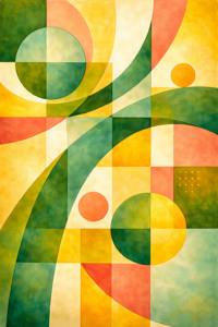
Balance also works in close relationship with other elements of abstract art, particularly composition, value, and colour. Strong contrasts in light and dark affect balance just as much as the placement of shapes. Similarly, intense colours can dominate a composition if they are not counterbalanced by quieter areas. In my painting, Country Kitchen below, I have tried to avoid colours that are too intense. Instead choosing pastel colours to dominate areas counterbalanced by light quieter parts of the painting.
A useful way to think about balance in abstract art is to imagine a set of scales. When the visual weight is thoughtfully distributed, the artwork feels grounded and cohesive. Balance is what allows abstract art to feel purposeful, guiding the viewer’s experience and giving the composition a sense of resolution, even in its most expressive and unconventional forms.
I hope the above description and the two paintings has given you food for thought!